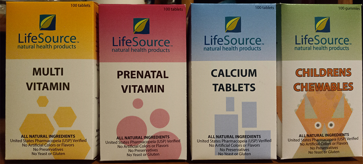
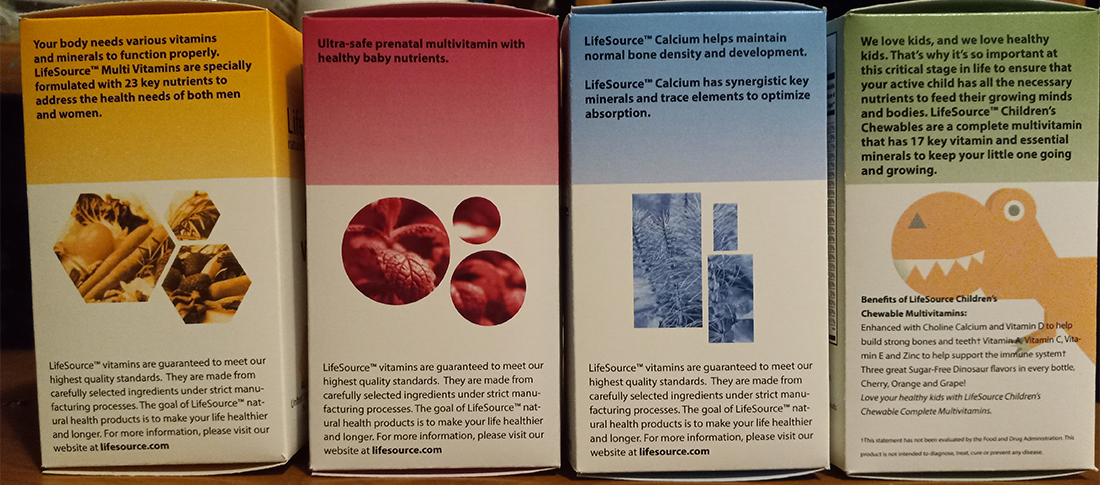
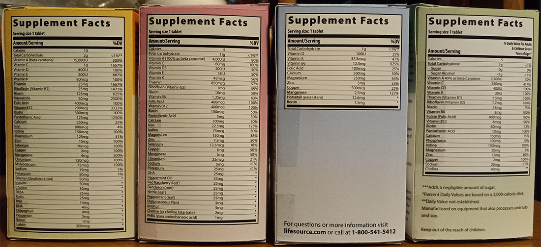
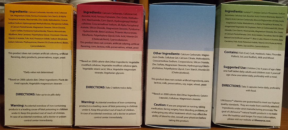
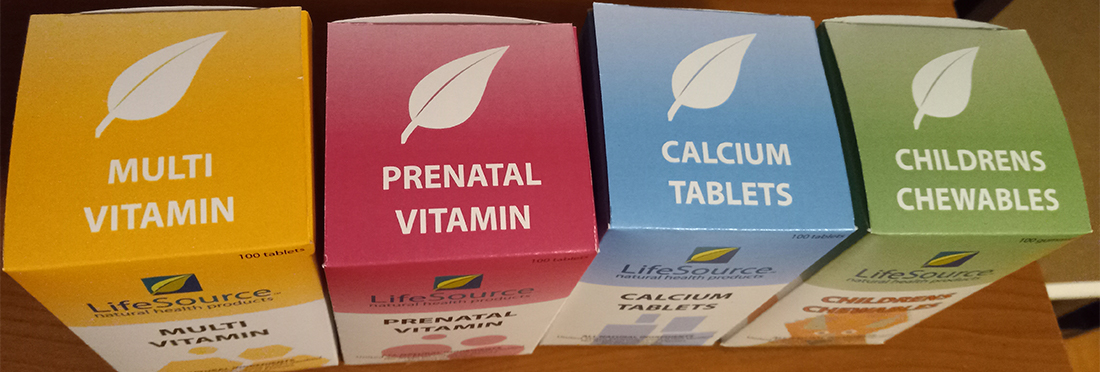
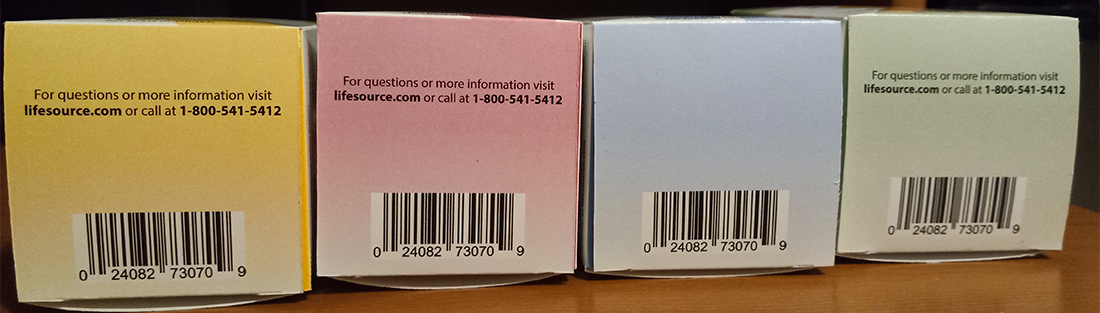
LifeSource boxes

Lifesource was an already established brand given to me for the assignment and I was tasked with creating a line of boxes for their product. I used shapes and different colors to make them stand out on their own but ket the layout the same so that you could tell that they are from the same line. All photograph used was found online and everything else was designed by me.

Rectangular boxes standing verically in a row, one has multivitamins(is decorated with hexagons), one is prenatal vitamins(is decorated with circles), one is calcium tablets(is decorated with rectangles), and one has children chewables(is decorated with dinosaurs)
Rectangular boxes turned left, you can see lines of type near the top and bottom, 3 boxes have shapes with photography in them and one has an illustration of a t-rex
The back of some rectangular boxes, you can see a list of the nutritional information, and the box containing calcium also has a call to action on the bottom
Rectangular boxes turned right, you can see an ingredient list along with warnings.
The top of rectangular boxes, you can see the lifesource icon which is a leaf, along with text describing the product in the boxes
The bottom of rectangular boxes, you can see a barcode and in three of them there is a call to action above the barcode