Street Magazine
Street is a magazine that provides their audience with the latest news on street and contemporary fashion. They provide in depth coverage on clothing brands, styles, and designers. The magazine targets young people in the age range of 18-25 years old due to them being the age range of people who follow trends. Their split would probably be 60% male and 40% female. The split would lean a bit towards males as streetwear has a large male audience. Household income would be between middle and upper middle class as this style of fashion is usually above the average cost of clothing. Their audience could be described as heavy consumers who like going out and being on social media.
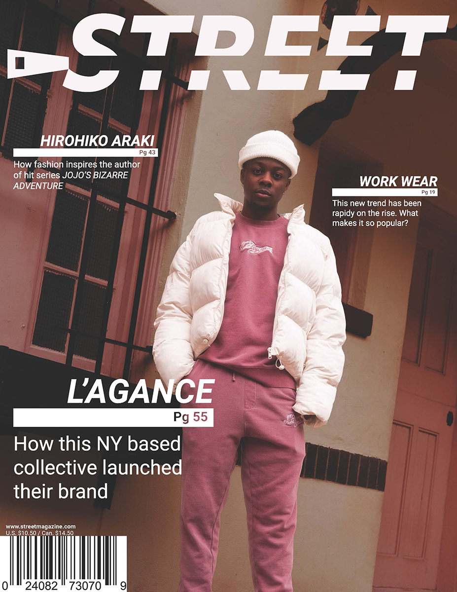
Street has a clean and sleek style with some sense of movement. This appeals to their audience because they like consuming information quickly. The sleekness and sense of movement is caused by their use of italicized type. Large underline bars that stick out from words also add to this as it makes text look like it is sliding along the underline. This sense of movement is a representation of the magazine being with the times as fashion moves quickly and is ever changing.
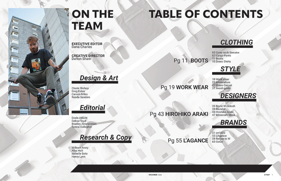
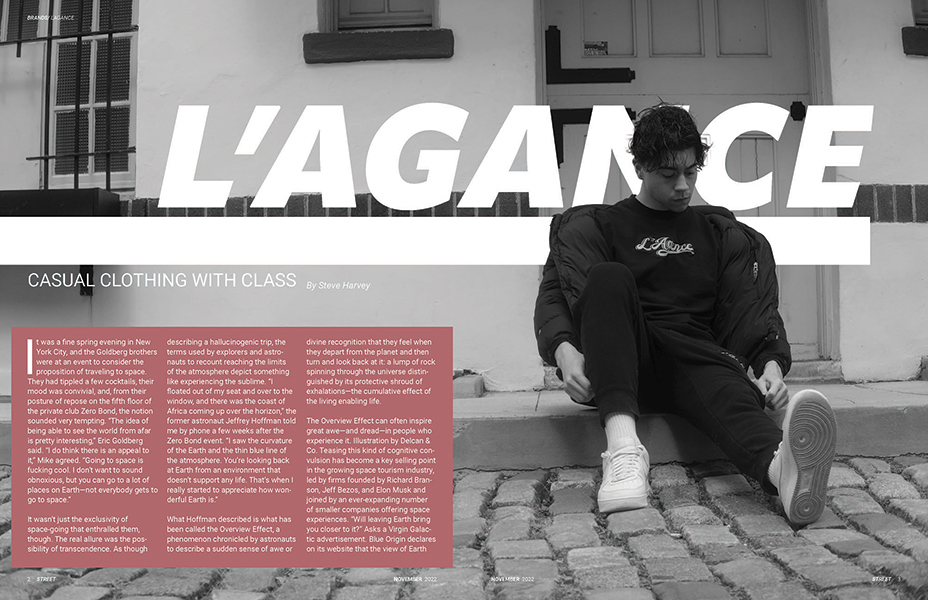
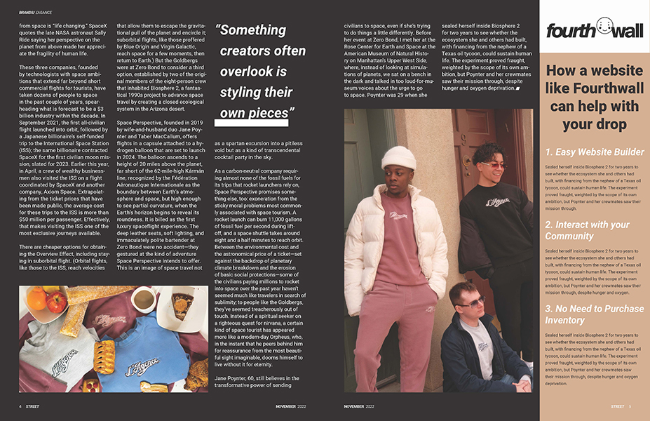
Street uses realist sans serif fonts due to its easy readability. This readability fits the sleek and clean style of the magazine appealing to their audience who consumes information quickly. Hierarchy in text is provided by size and the boldness of the stroke. Bold is applied to almost everything besides body text, sub heads, and by lines. Another layout choice influenced by the audience is having text not fill up a lot of pages. Walls of text would probably turn away the audience so the odd pages in the article are taken up mostly by an image. Large images are also great for showing off clothing and how it looks on someone which can influence people to buy them.
The magazine isn't aimed at a specific gender so it does a better job at not turning away a broader demographic. The use of only realist sans serif is very accessible and its color scheme is not anything that is too striking. Street has a heavy use of black and white with some pastel or tinted colors. This gives off a more relaxed feeling which can be inviting to an older audience. The previous layout choice of not having too much text also appeals to a broader audience because if there is less text they are more likely to read it as it is less of a time investment.